McKesson
Evolution of a Legacy
Reimagining an 18-year-old logo to meet a new era in healthcare information technology
Project
RelayHealh Logotype Redesign
Medium
Identity
Role
Creative Direction
Logotype Design
Identiy Design
Visual Strategy
Year
2017
Objective
Reimagine and update RelayHealth's logo for an ever-increasing competitive landscape that would respect its 18-year pedigree in the healthcare IT sector, resonate better with modern audiences, and capture the forward approach of its portfolio of new products and services.
Solution
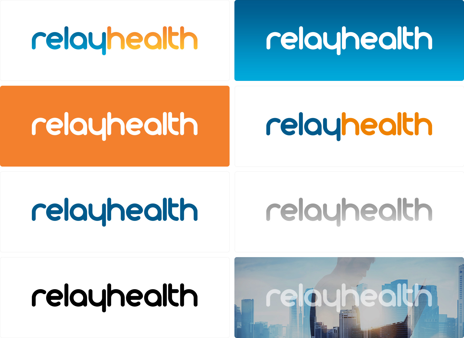
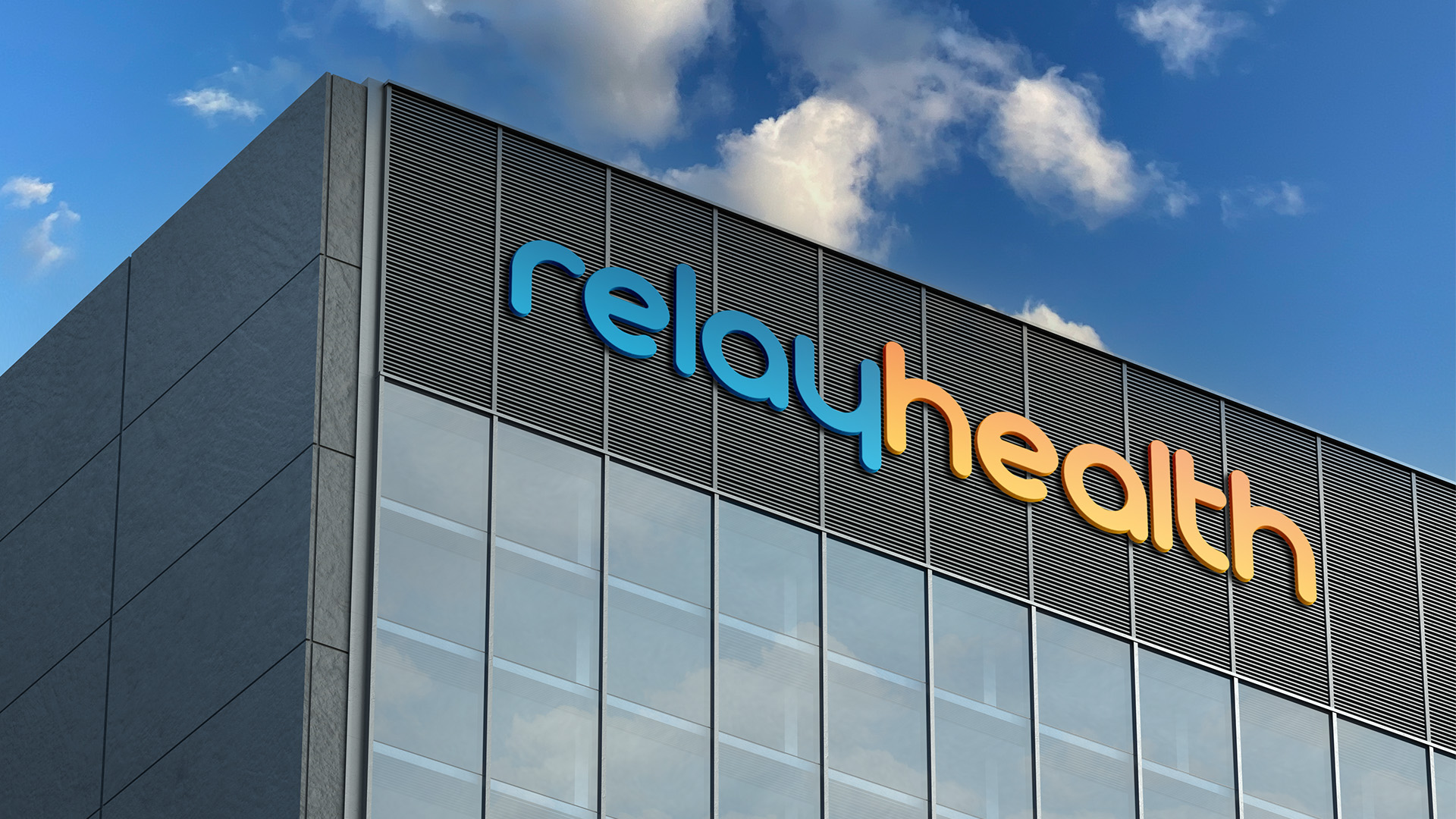
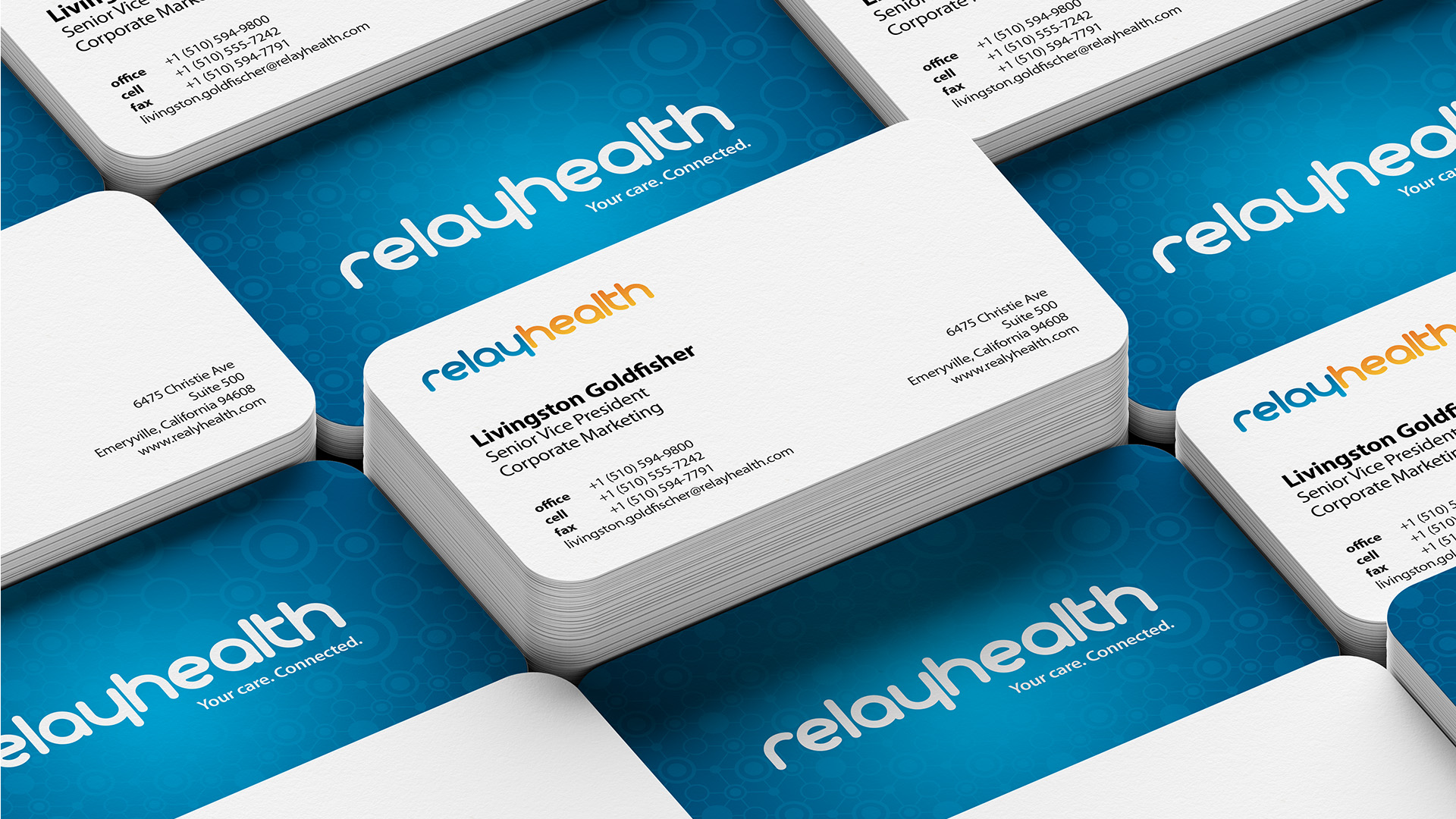
We developed a simplified, softer, visually cohesive, and fluid logotype with a distinct silhouette that didn't require an additional mark. These characteristics lent to a more approachable and distinctive brandmark that seamlessly integrated with the brand identity refresh conducted three years earlier.

Project Background
Launched in 1999, RelayHealth was one of a handful of companies providing web-based provider-patient messaging, among other healthcare-related information services. The logo, developed for their launch, managed to serve them through their corporate lifespan, even managing to survive an acquisition by McKesson Healthcare in 2006. As the web evolved and more social media-centric and mobile channels arose, in addition to the natural evolution of an increasingly crowded market space, it was becoming more evident that the brand would benefit from a refreshed identity.
Original logo created in 1999
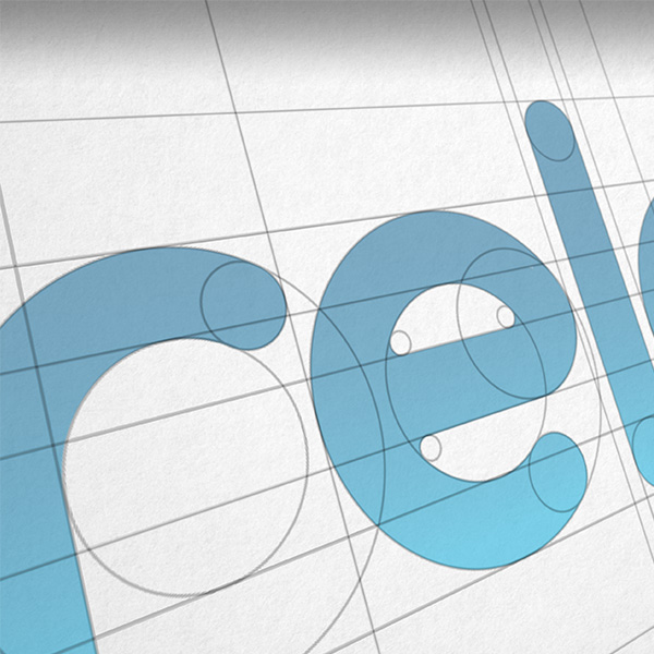
Animation demonstrating shared letterforms and visual recursion in the logotype
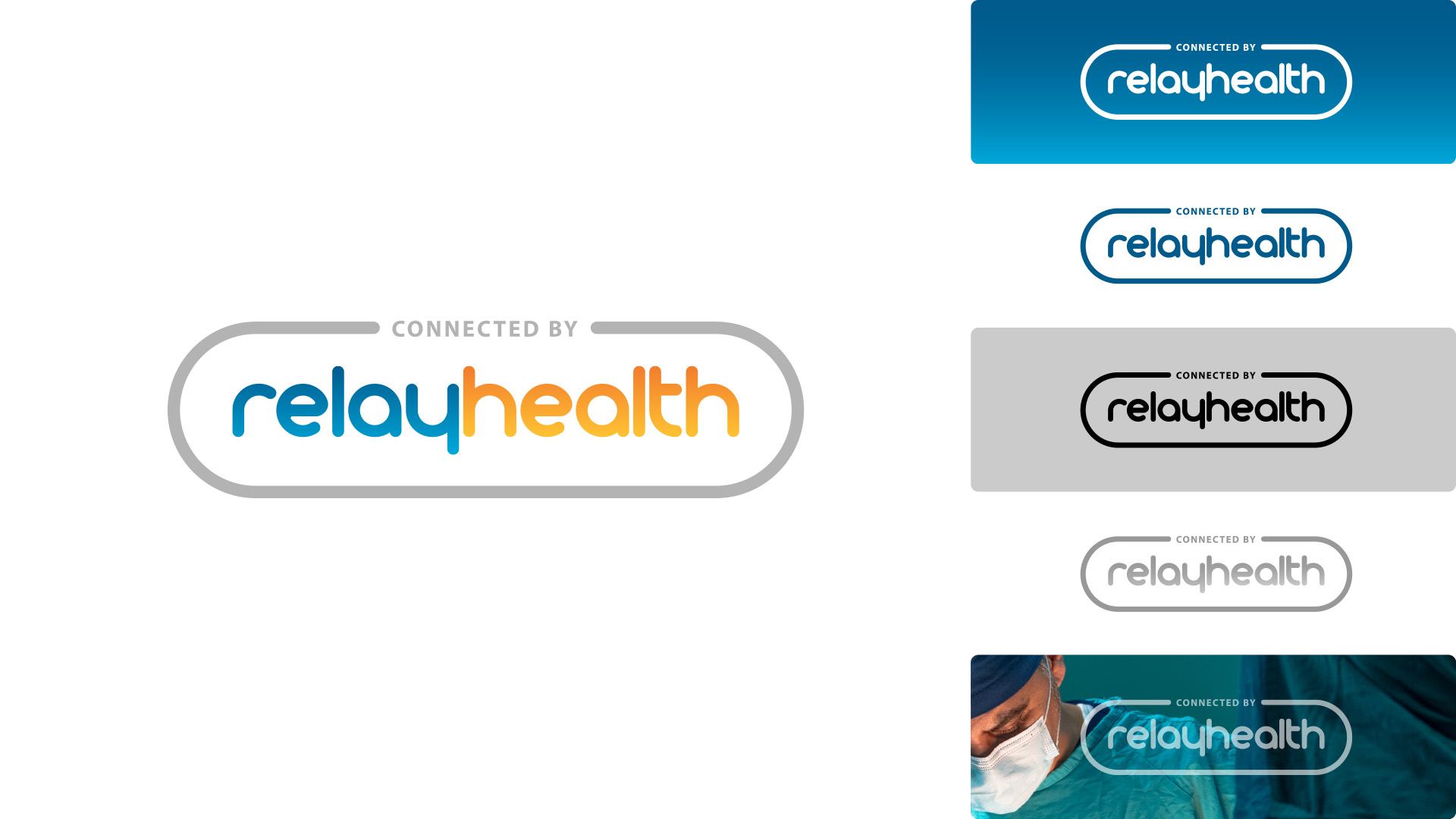
Brand Activation


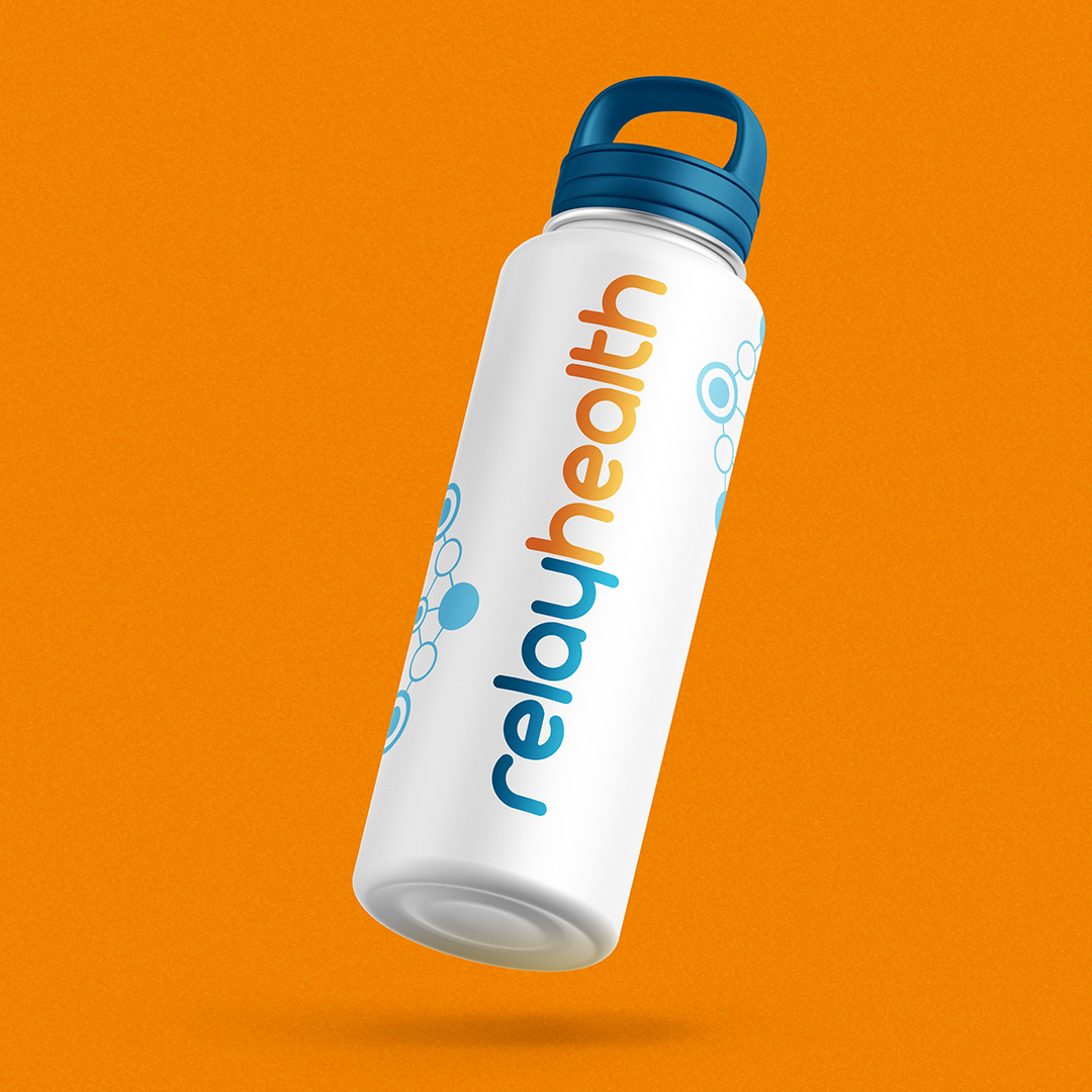
Ingredient Branding
As vital elements for RelayHealth's hospital and clinical partnerships, ingredient branding variations of the logotype were essential. These badges appeared in various settings, from in-hospital/clinic advertisements, whitepapers, and websites, among many others, demonstrating RelayHealth's pivotal role in ensuring reliable interoperability for networks, providers, and patients.