McKesson
The Power for Better Data
Building a cohesive, seamless, and dynamic brand identity for a quantum leap in healthcare data analysis and coordination
Project
Fuse Brand Identity
Medium
Integrated
Agency
EPAM (San Francisco)
Voice & Tone Codification
Role
Design Direction
Brand Strategy
Identity Design
Visual Design
Verbal Strategy & Tagline
Year
2017
Objective
Under its RelayHealth banner, McKesson was on the precipice of launching its flagship platform, Fuse, designed from the ground up to revolutionize patient data integrity and analysis. Corporate leadership needed a brand experience that encapsulated the transformational leap Fuse would deliver to the healthcare industry, driving the technological and philosophical foundations behind its development and securing it as a continued leader in the sector. This new brand was required to be standalone as it would also be marketed a neutral platform for competitive organizations.
Solution
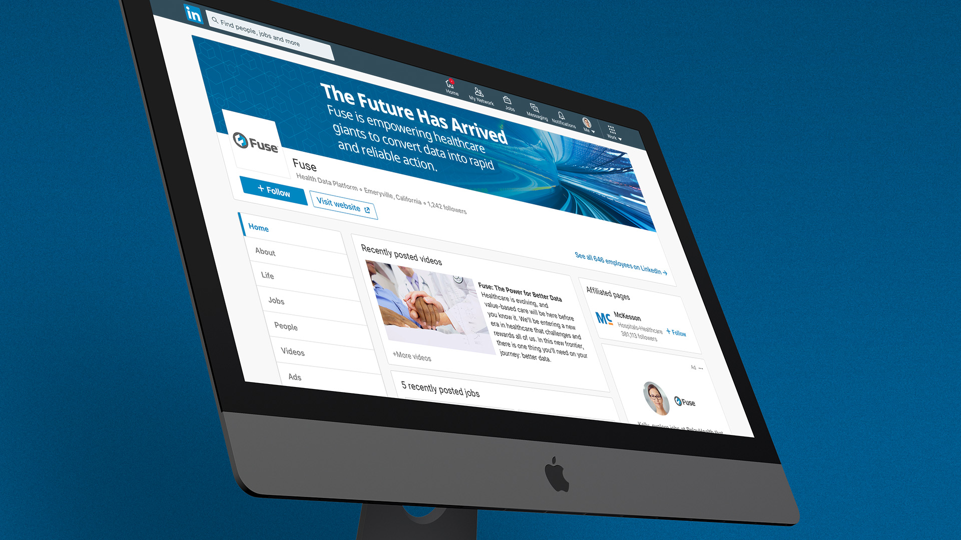
In the Spring of 2017, Fuse was launched at that year's HIMSS global conference. The new brand's only tether to McKesson was incorporating their primary color scheme. A unique logo that captured the mission ideology, a new font and visual approach, and voice and tone were all employed. These elements helped Fuse differentiate from competitors and have brand autonomy in the marketplace, allowing it to reach further than it would have as a sub-brand. The final result reflected McKesson's commitment to improved health data integrity and patient care.
Finding Fuse
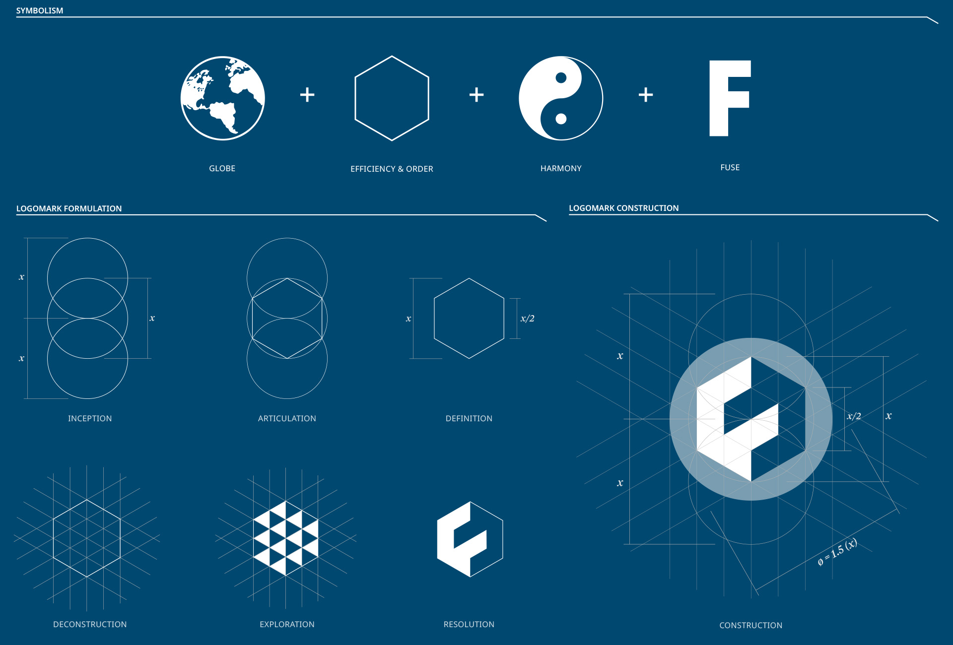
During the naming discovery process for Fuse, we collected inspirational images to collage mood boards representing varying ideological perspectives on what to name the platform. In this collection of visuals spanning physics, biology, art, music, and architecture, a recurring visual theme revealed itself, one so familiar it is often overlooked: the hexagon. The universe leverages its efficiency from the molecular to the cosmological.
In his book, A Beginners Guide to the Constructing Universe, Michael S. Schneider wrote: "Hexagons contain a message that efficient structure, function, and order are happening." This assessment, which reflected the core messaging behind Fuse, drove my exploration of this shape and how it could inform the logo and identity design.
Discovery & Construction
The hexagon shape, chosen as the core of the logo, revealed a unique geometry upon analysis. Its intrinsic and extrinsic structure, derived from proportional geometry, offered dynamic possibilities in combination and hierarchy. While the hexagon held immense potential, aligning it with strategic brand factors was crucial, foremost being Fuse's mission of achieving data harmony across clinical networks. Because the Yin-Yang symbol was a recurring theme in the mood board process, it became a key influence on the final design.
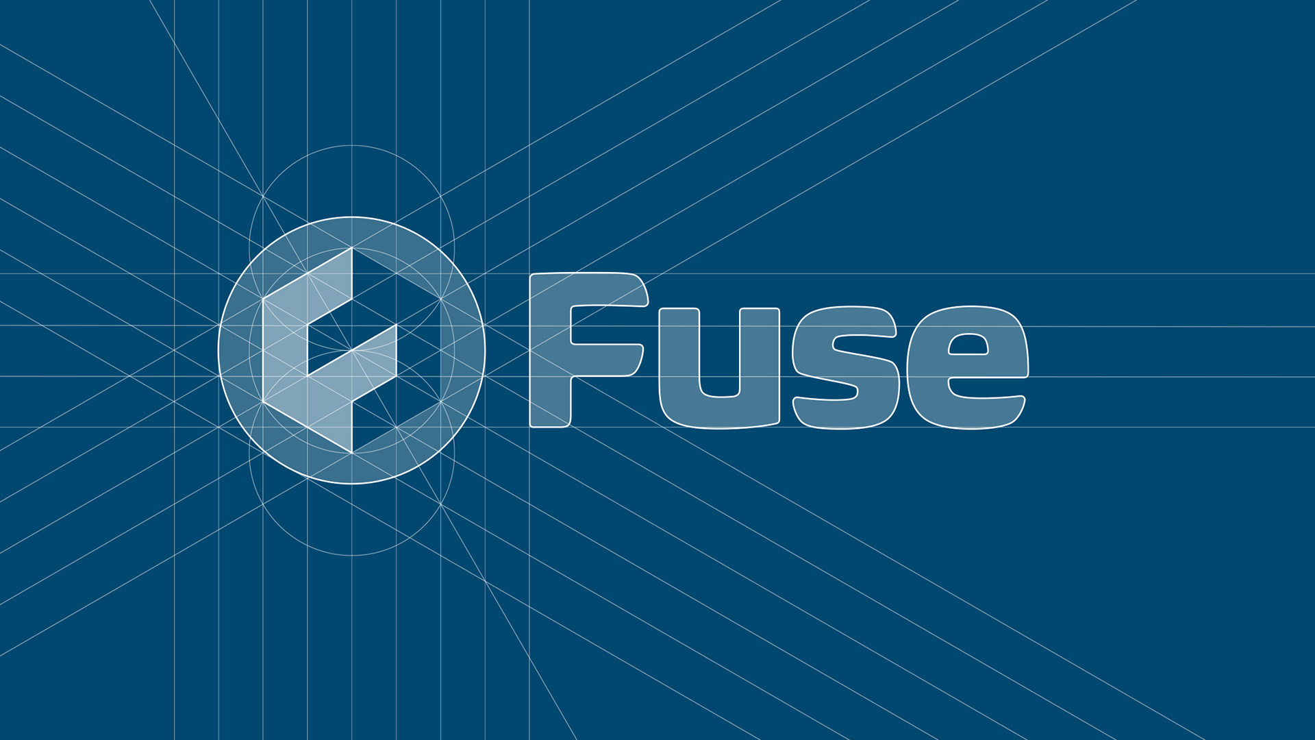
Logo Typography
The logic behind the letterform for the wordmark was to create an equilibrium with and fortify logomark's strong geometry as well as nodding to the platform's connection to patient care. After numerous auditions, Biome by Carl Crossgrove emerged as the perfect counterbalance. It complemented the Fuse logomark with a polished, futuristic silhouette while retaining humanistic elements.
Color Palette
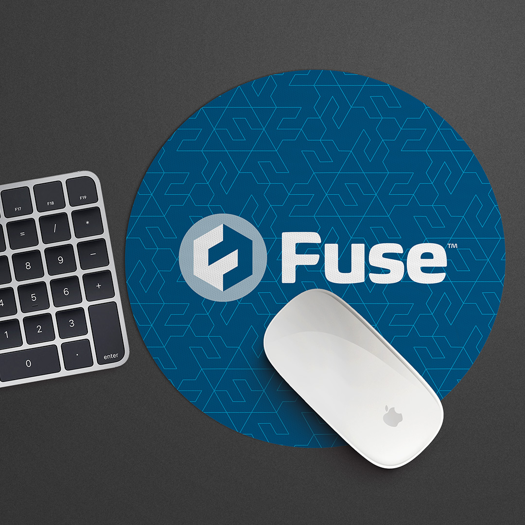
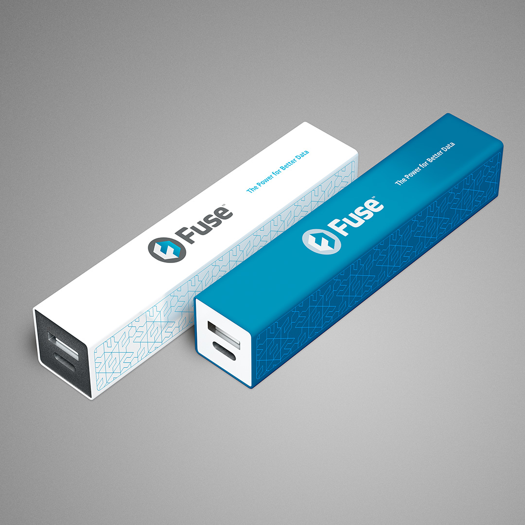
One of the primary ways we linked the Fuse identity to the parent McKesson/RelayHealth brand was through color. We adopted most of the original palette, augmenting it with new tints, shades, and an additional color, aqua. The additions created a broader pool to draw and develop an engaging identity and afford new experiential tones to augment the customer journey.
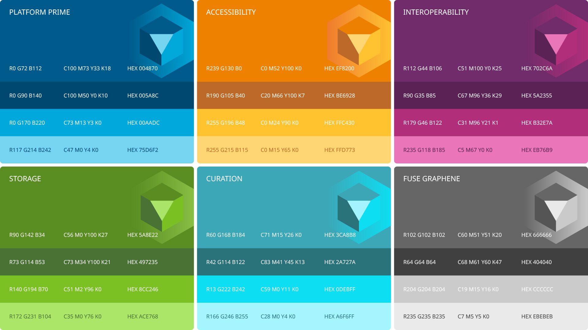
Fuse Logo System
Part of the strategic communication plans for Fuse was parsing out its primary feature set—interoperability, storage, scalability, and curation of health data—and curating a distinct customer experience subset for each. We addressed this by creating a spectrum of logos reflecting each communication setting using the color palette to inform the design. Besides versions designed for light or dark backgrounds, we created a tinted utility set intended for information graphics and similar settings–places the Fuse logo would be more effective in a visually integrated state.
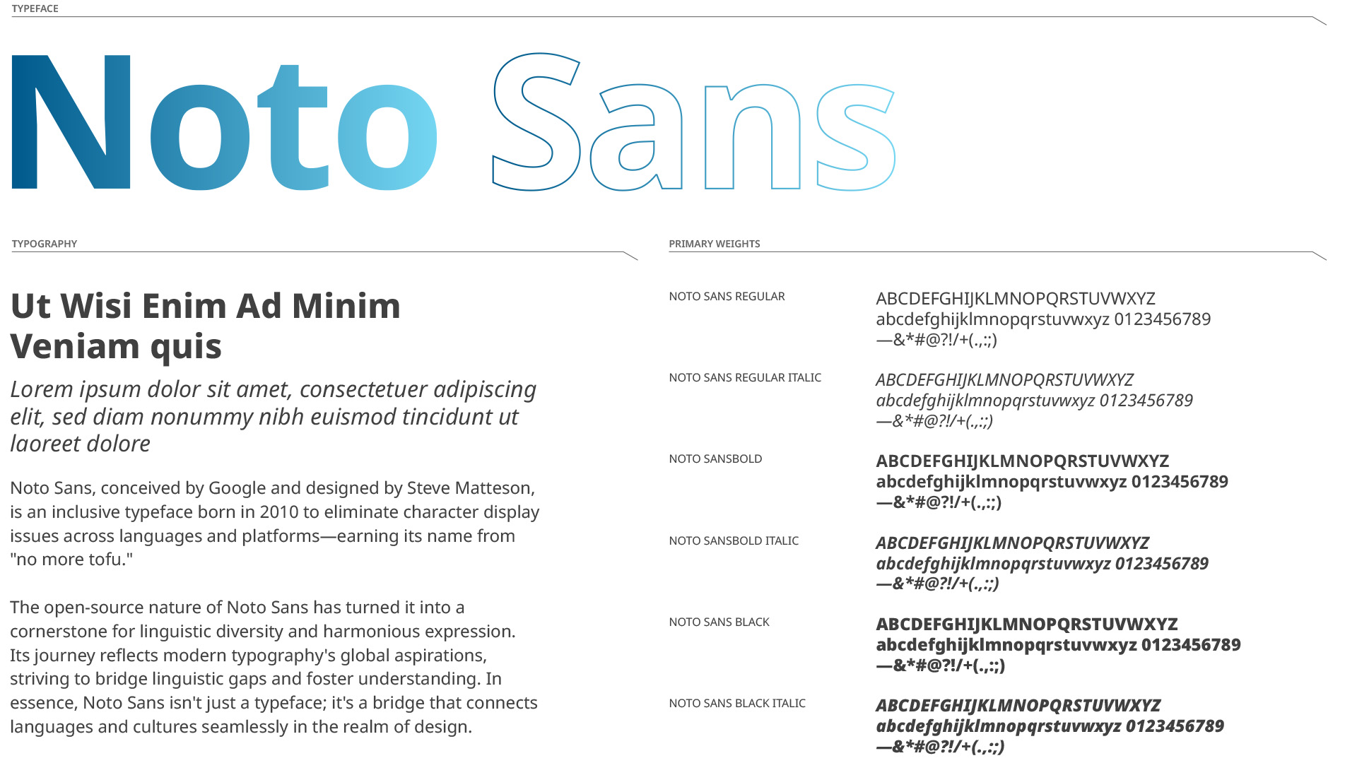
Typography
At its core, Fuse is a data platform with requirements beholden to user interfaces and data presentation. With this in mind, I researched fonts that would render well at all scales, from mobile screens to billboards. Noto Sans was chosen for its inherent humanistic feel and expansive, multi-lingual character set that would support international audiences.
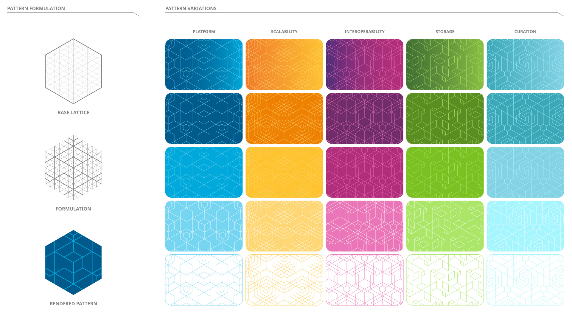
Feature Set Patterns
To further develop a distinct set of visual experiences around the feature set of Fuse, I crafted a series of five representative graphic patterns. As with the hexagon deconstruction grid that informed the logo design, I made a further sub-divided version that would act as the baseline structure of the pattern framework. Inspired by the unique tesselation qualities of a hexagon grid and the nature of snowflake formation, I designed seamless abstract patterns that each reflected an aspect of the Fuse feature set in addition to one that would represent the overall platform. I created diverse combinations appropriate for different communication settings using the full-color palette.
Imagery
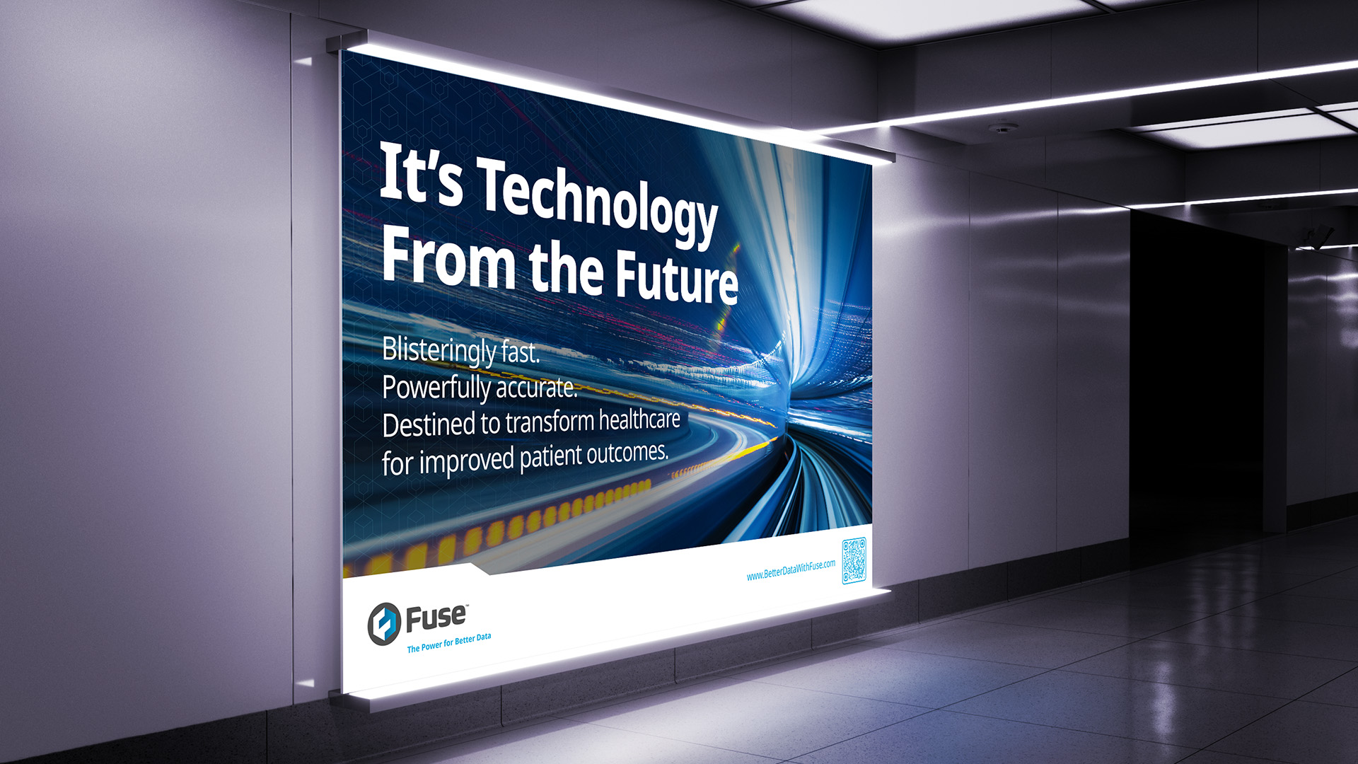
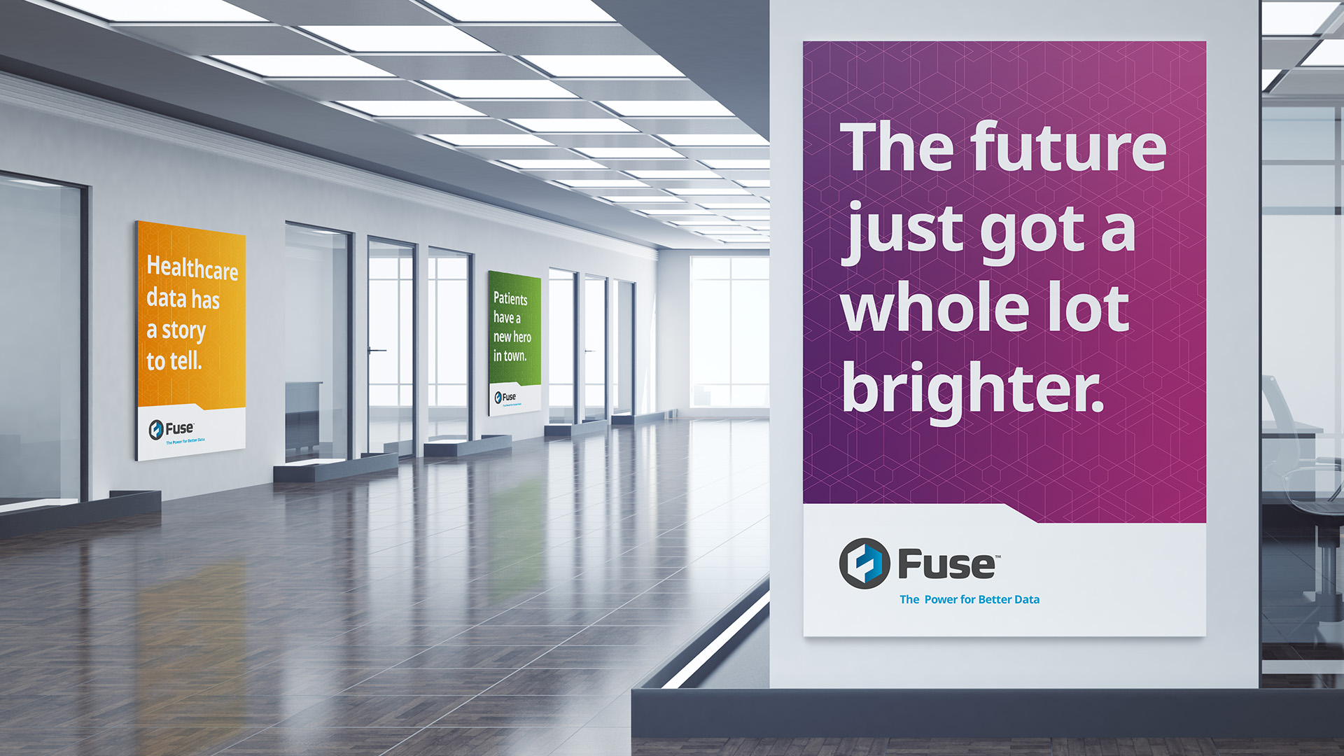
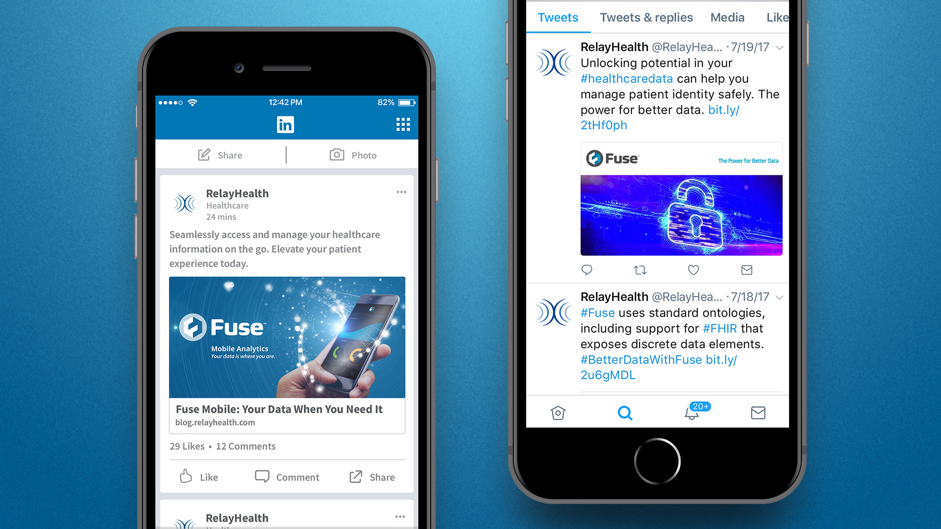
The Fuse brand imagery needed to be vibrant, energetic, and future-forward, abstractly portraying the new frontiers of the data-driven healthcare industry. Because the literal portrayal of the platform itself was challenging, I selected imagery evocative of the brand voice and tone for different stages in the customer journey and the intended emotional state specific to each step.

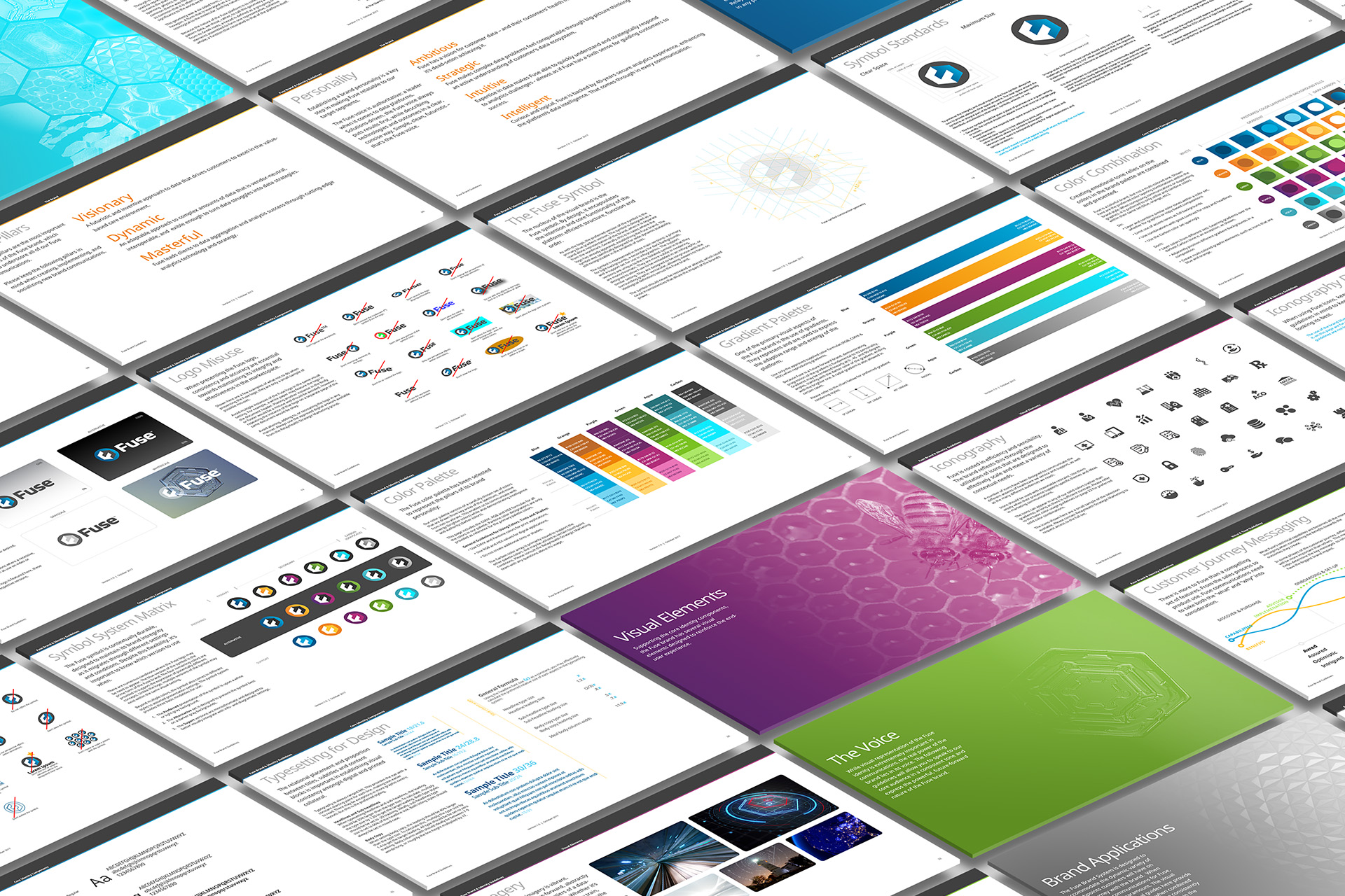
The Fuse Brand Guide
Once the brand components were defined, a comprehensive 42-page document for constructing Fuse brand experiences was created for partners, vendors, and developers. In addition to the standard visual brand components, the guide included an in-depth section on voice and tone, preferred terminology, and grammar.
Brand Activation

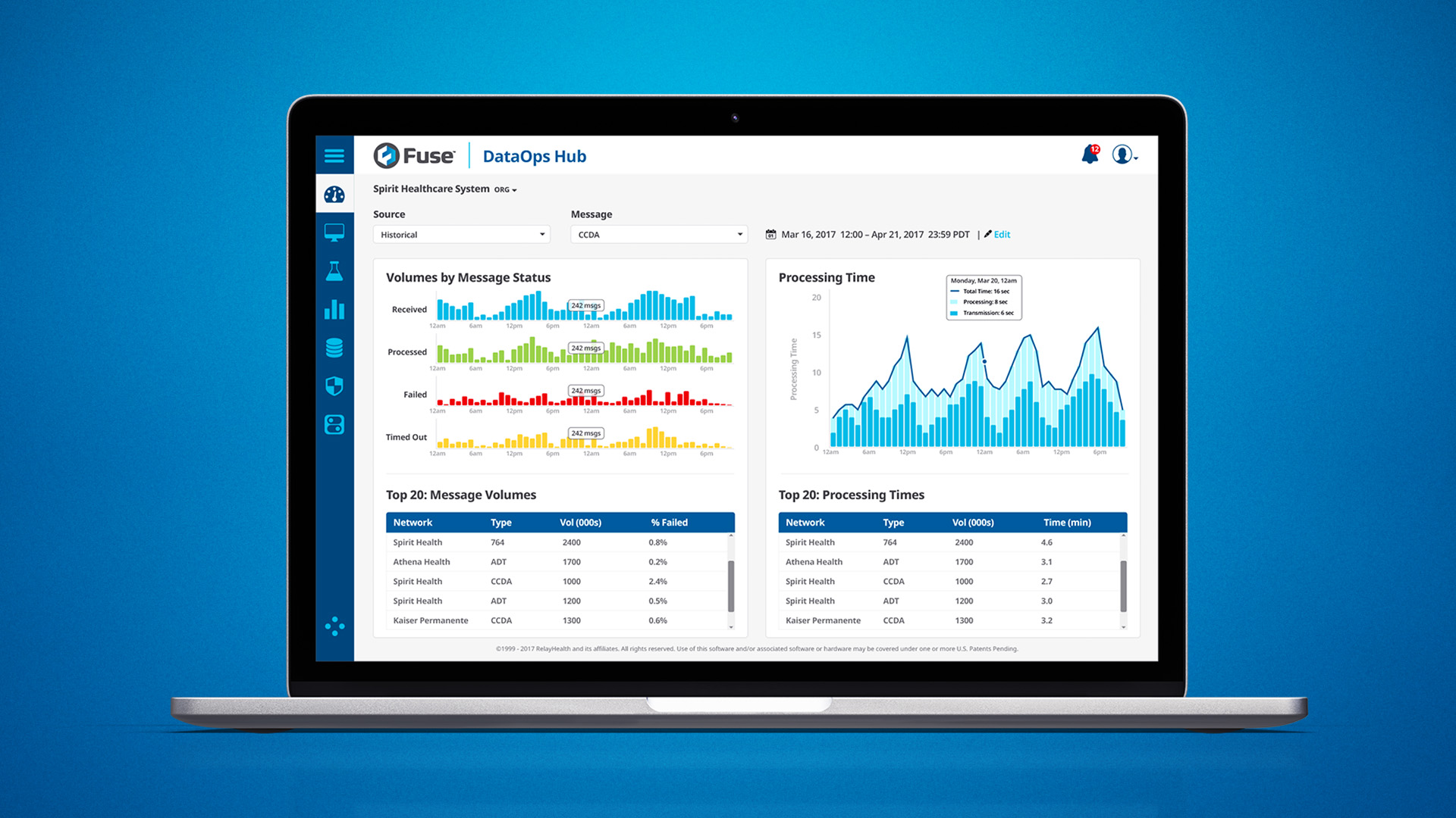
The Fuse Dashboard
In tandem with the brand identity development, I worked closely with the RelayHealth applications team as a brand advisor. Providing insight into color, typography, and iconography use, we established a comprehensive design system that became the foundation for the Fuse dashboard application interface, complementing the go-to-market brand experience.