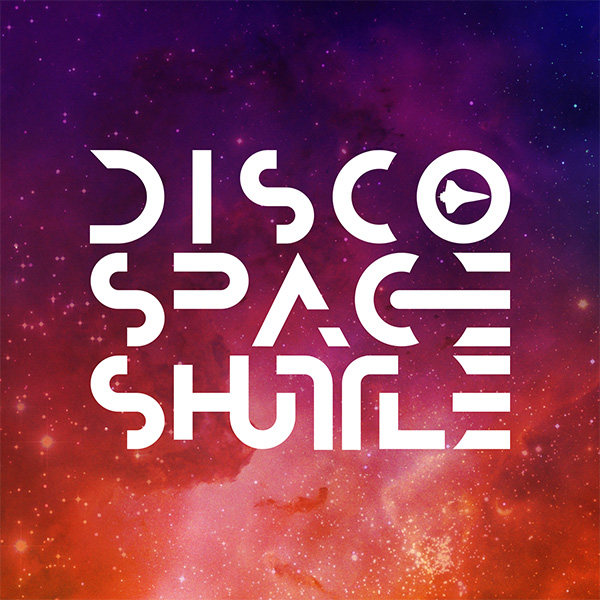
Disco Space Shuttle
Go for Launch
Creating a visually dynamic logo for a vibrant art and music community
Project
Disco Space Shuttle Logo
Medium
Brand Identity
Role
Creative Direction
Logo Design
Motion Graphics
Year
2018
Objective
Craft a distinct and creative logo that reflects the collective imagination of a vibrant art and music community dedicated to providing state-of-the-art events for its members and followers.
Solution
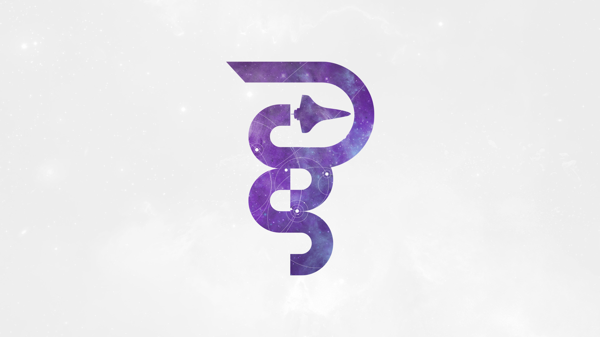
Working with community leaders inspired me to blur the lines between logomark and wordmark to create a hybrid graphic as a unique symbol conveying the community's name. In addition to the full-form wordmark, I developed a distilled version that addressed the need for iconic representation with elements from the primary design.
Harmony in Perception
Inspired by the geoglyphs drawn in the Nazca Desert in southern Peru, I formulated a design centered around interpolative proportion that would tap into collective archetypes commonly found in those drawings. With their colossal, intricate shapes visible only from a bird's-eye view, the Nazca Lines beg observers to see beyond individual elements and comprehend the grander design.
Giving each word of the community's name equal presence was essential for the logo. This led to the contraction, expansion, and deconstruction of individual letter geometries to accommodate spatial equity in the wordmark. This approach visually financed the utilization of Gestalt design methodology to create a cohesive and proportional solution where a collection of organized shapes—letter forms released from their recognized geometries—afford the perception of the organized whole.
Motion logo and wordmark bumper for community videos